photo 150FB.png photo 150G.png  photo 150Twit.png  photo 150DA.png

June 27, 2012

Fantasy Character Portrait

So many of my lovely art pieces must be left at home throughout the course of the school year while I'm away at college...It'll feel rather peculiar to not be able to pull out any old sketch I have a notion to reference the instant that notion strikes. However, its all for the sake of something even greater.

After all, its not goodbye, really. These artworks will go into storage, protected believe it or not from damage or dust, out of sight, and perhaps not entirely out of mind. By setting some of these more mediocre works aside, these sketches, portraits and doodles which aided me in my journey towards satisfactory skill, I can make room for those which are yet to come. With great anticipation do I await the next set of brand new, electrifying artworks that will enable me to further advance my skills and talent.

This is an older portrait of an original character I devised quite some time ago. You see, a lot of my characters are simply reinvented in my artwork much more frequently than new characters are invented. Once a portrait such as this is complete I can assess the essence of the piece and decide for myself whether it seems familiar or strange (often times both). This character has no name, but is illustrated here as a sort of creature that is plant-like in nature. Her hair is made to appear as flower petals, and her skin is thin and clear, like a plant membrane. Although this image doesn't show it, she also has wings that are actually extravagantly sized autumn leaves. The eyelash decal are sort of a standard signature of mine when drawing specific female portraits.

New art is coming soon, whether it be tomorrow, Friday, or perhaps sometime next week. Mainly the time this art is posted will depend on my motivation during the next few days.
-KDVan


Facebook: Krystal Dawn
Twitter: KrystalDawnArt
DeviantART: kekei94

June 26, 2012

Dragon Sketch

Strange as it may sound, some of my favorite artworks I devised while doodling in the margin of school notebooks while taking notes. Here is one of those such favorite drawings.

I simply came up with this design as I went along; I began with the exaggerated curve of his upper eyelid and worked valiantly onward throughout the complete decadent spiral that unfolds his serpentine body. I'd love to illustrate a full color version of this drawing in order to emphasize the variance in scale detail and feather design. The wings were exceptionally entertaining to draw, and I love how the face and snout of the dragon came out.

If you were to examine this picture closely (or at all, rather), you would perceive the fact that this picture is not indeed complete, and is actually rather unfinished. You may also notice that this dragon beast was drawn on notebook paper-- every good artist keeps a sketchbook on hand, bu not every one can fight the urge to draw upon whatever paper lay before them or closest at hand when the long-awaited and fabled fabulousness of inspiration strikes. I happen to be one of those artists.

I also happen to be notorious for misplacing my artwork, and recovering it in a damaged state. This tends to happen to my sketches and simple drawings, that is, because I have a tendency to place them in folders where the edges of the paper becomes wrinkled and creased. Tightly packed peachy folders to not make good homes for legitimate artwork-- something to keep in mind.

-KDVan


Facebook: Krystal Dawn
Twitter: KrystalDawnArt
DeviantART: kekei94

June 25, 2012

Improvements

Reoccurring more often than any other type of drawing are my monochromatic, black and white graphite portrait illustrations. While each and every individual artwork presents itself to me with new hardships and difficulties to overcome, as well as the gift of new inspiration, hard-earned skills and precious experience, I sought to change things up in the tiniest bit possible-- I added color.

As you can likely tell, this particular illustration is more comic book inspired, more similar to a line drawing than a photo realistic image. However, every artist must start somewhere. While the drawing of a portrait in color is theoretically the same as drawing it in shades of black and grey, it is so very, very different. the whole color aspect adds a new dimension to the art, adding a new layer of complexity necessary to complete a satisfying final product.

This is an original artwork, based on an old sketch of a girl with two rings in her lip that never made the final cut for public viewing. Her eyelashes were exceptionally fun to draw, and the hair took the longest. I chose to make blue the color of her lips and faux lashes to add a little more excitement to an otherwise fairly standard color illustration.

Hopefully this will be the first of many more color illustrations to be posted online along side my portrait work. I see no reason to not share with my audience the pleasure of seeing this particular style of my art improve over an amount of time. My portraits went from about this level of depth (black and white, albeit) to photo realistic within a time frame of less than a year. Its a matter of how much time and work I put into it, and how many drawings are made in the process.

I hope all of you enjoy this new artwork, and will stick with me as my art style changes and improves over the course of the summer. If you haven't already, like my facebook page "KDVan" to get quick news on new projects and posts. Remember, art isn't just a hobby; its a lifestyle.
-KDVan

Facebook: Krystal Dawn
Twitter: KrystalDawnArt
DeviantART: kekei94

June 24, 2012

Katy Perry Portrait

There  was this fantastic Katy Perry quote I read in a fashion magazine once; when asked what she saw when she opened her closet doors, she replied "A tornado of fabulousness and rainbow colors."  I suspected as much. All joking aside, it is Katy's strange quirks that make her seem so real.

It just happens that this portrait was drawn during the same day that I drew the Taylor Swift portrait that was posted online a few days ago. Overall the drawing is decent, but there are several major setbacks to this illustration. For one thing, the drawing isn't actually that detailed. Most of the details present are located in the varying shades of line that make up the shape of her vintage hairstyle. another flaw is the positioning of her features on her face. Perhaps I simply was too caught up with copying the reference photo to notice the proportions were off quite a bit; by the time i noticed it was too late to redraw her nose or anything else, so I just let it be.

The image cam from a nail polish advertisement I found in a Seventeen magazine. If I'm not mistaken, her hair was blue in the picture, and the daisies were various unnatural colors. It was drawn with graphite on scratch paper, with a q-tip used in place of a tortillion for shading-- the usual set of tools.
-KDVan


Facebook: Krystal Dawn
Twitter: KrystalDawnArt
DeviantART: kekei94

June 22, 2012

OGPC Enemy Concept Art

I decided to go ahead and post the enemy design from our OGPC video game as well, while it was still fairly fresh in my mind. Here I've included the finalized rough draft, the scanned and computer-edited black and white outline, and finally the completed full color illustration.

Originally there were to be three variations of this base enemy: one which was purple and off-white, such as the one below; one which was green and off-white; and one which was a rarer, more powerful all-gold enemy. However, due to time restraints, I wasn't able to make this a reality. Notice also the lack of shading on the alien creature's body? A remastered image was colored, but whereas the tail and body looked better the colors were slightly off and ultimately it was decided that the original image should be used for the enemy sprite instead.


I have some brand new artwork ready to be posted online, and some exciting projects in the process. I want to give a special shout out to everyone who checks out this stuff as its posted-- all of you help support my artistic endeavors and ambitions, for which I'm grateful. To all of you, thank you, thank you, thank you.
-KDVan


Facebook: Krystal Dawn
Twitter: KrystalDawnArt
DeviantART: kekei94

June 20, 2012

Oregon Game Project Challenge: Concept Art

This past school year I got the chance to directly experience and be a part of OGPC competition. The competition consists of high schools throughout the state designing and completing a fully functional video game as according to a previously designated theme which then competes against the games of other teams. The idea is to encourage students become programmers, designers, and innovators.

I can not express enough how much I enjoyed being a part of this event.

I joined our school's particular team a little late in the year, but still managed to get the position of lead art director after proving I was up for the challenge. Our perspective on the this year's theme ("urban planning") lead us to the creation of a classic tower defense game. Here, I have posted the initial final rough draft (there were worse ones before it), the mid-process color illustration and finally the final product that ultimately was the image used as the "tower" which you were protecting. The image was small enough during game play that we ended up placing the image on the menu screen so that players could appreciate the amount of detail that went into quaint little building.

As concept artist I drafted our menu screen layouts, enemy references, and worked as lead graphic designer as well. Everyone on our team had an important role to play in the completion of our game and worked hard to achieve that goal. It was a lot of fun working side by side with other people who loved video games as much as I do, so much in fact that I hope I get the chance to have such an experience again someday, maybe working in a professional environment.

The lovely photo to the left was taken with the awful camera on my lovely phone.
Would you play a video game I helped design?
-KDVan


Facebook: Krystal Dawn
Twitter: KrystalDawnArt
DeviantART: kekei94

June 19, 2012

Taylor Swift Portrait

Sometimes things don't go exactly as you plan them to. That's what happened here.

This is a portrait I illustrated last year of Taylor Swift for whichever art class I was taking at the time. It was near the end of the school year, and I had completed little artwork on account of the fact that one of the other students in the class, who was a complete stranger to me earlier that year, and whom by this point I was rather good friends with, consistently helped me distract myself from work.

I remember I was home seriously sick with the flu, and upon beginning to recover, I sat at our kitchen table, reluctant to move out of fear that I may become more sick if I did so. I had some notebooks and paper sitting there, since I was hoping to bully myself into working on homework (much more important than bullying myself into eating, as according to my stomach at the time). What happened instead was that I pulled out the Taylor reference picture I had printed at school earlier that week and began setting my fingers to work. I completed three full portraits during those hours, two of which I admired, one which I hid among my other failed sketches, ashamed.

It doesn't quite look like the image I used to draw her, specifically due to the shading on her jaw, which was peculiar enough in the picture and difficult to exactly replicate. I did the best my ability would allow at the time, which was rather well I feel, considering I was rather ill.

I hope you guys enjoy this Taylor Swift drawing, and will check out my other artwork, as well as the portraits and designs yet to come.
 -KDVan


June 18, 2012

Comic Book Thumbnail: Page #1

Sometimes it seems that I have to many ideas to even begin to possibly express each and every one, whether through words, writing or my art. Some ideas go only one way; for example, there are ideas that I can simply never put into words, or ideas that I can only explain with precise diction and specific syntax.

The culmination of these artworks were ideas that were difficult to push one way or another. 

Theses illustrations represent a sort of rough comic book thumbnail mock ups. More thought and emotion, effort and ideas went into these four artworks than any person could possibly guess, and yet they are still quite incomplete. I can certainly see detailed colored digital renditions of these images being a guaranteed future endeavor...


This is the first page of four comic book thumbnail concepts. Specifically, this piece is a sort of splash page representing where the title and comic specifics would be (Chapter title, credits, etc.). Look for the other three later this week, or perhaps later this month. I despise repetition, so I may post other artworks in between these so there's a little more variety.


Perhaps one day I'll have the time and discipline to sit down and craft something magnificent. For now, let's just see where today takes me.
-KDVan


Facebook: Krystal Dawn
Twitter: KrystalDawnArt
DeviantART: kekei94

June 17, 2012

Happy Father's Day!

There is not a single doubt in the mind of anyone who knows my dad that he LOVES movies. Ghostbusters, Back to the Future, Weird Science... He can't get enough vintage movie magic. 

...And what movie franchise demonstrates movie magic quite like Planet of the Apes?

  Hoping to commission myself to create an artwork that does the franchise justice, I drew a graphite portrait of Cornelius. This particular drawing took me multiple hours to complete. Specifically, somewhere around 6 hours, I believe. It's hard to tell one hundred percent, since around my house it's difficult to find time to do much of anything without interruption from one thing or another, meaning that I was constantly setting aside my artwork to do anything and everything from chores to babysitting. However, I managed to complete my artwork within my given time limit, and was extremely happy with the result. 

One of the things that's seriously cool about the original Planet of the Apes is the makeup and whatnot that was used to give the actors their ape-like appearance. No computer generated images, that's for sure. While that sort of craftsmanship isn't exactly my cup of tea, I can rightly appreciate how much work went into projects like this in similar movies. I had a lot of fun working on this project, especially since the ape's face is just different enough to make drawing a portrait feel like a unique and new experience.

It may not be the Planet of the Apes trashcan you saw at Billy Galaxy, but Happy Father's Day, dad!  I have so much fun working on projects with you, whether we're building another IKEA bookshelf or piecing together Teenage Mutant Ninja Turtle action figures. I love you!
-KDVan


NOTE: A limited number of prints of this artwork are now available.
\


June 8, 2012

I Scream...

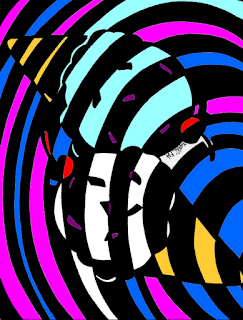
I love finding past artworks that I had written off as so absolutely finished, complete, and unbearably "done" that they were stored away in some discreet pile of random papers, stuffed in a corner and left to collect weighty dust. What I love even more is finding these pieces and seeing the potential that time has given them-- the potential I had been blind to during our previous encounter.

This is one such artwork.

 Once an assignment for a middle school class that was not art related, we were to study the spatial relationship between positive and negative space and create a visually appealing product simultaneously. We were told to draw a relatively simple shape, draw lines through it, then color every contacting space an opposite color.

Originally drawn in pen, probably sharpie, I have digitally remastered my old creation and have given it a bit more to look forward too. I didn't actually post the original artwork, but instead used a photo-editing program to recolor the black and white spaces, eliminating the pen markings, then posted this as a sort of "monochromatic" version of the illustration. This piece is fairly simple, vastly modernistic and contemporary, and vivaciously fun. If I were asked to sum up this piece in one word: vibrant.
-KDVan


June 6, 2012

Art Class Wrap Up: Mixed Media Collage


People who are familiar with the sort of work I do know that my typical first choice medium when working on an artwork are graphite pencils, especially when working on serious, realistic artworks, such as portraits. 

This aside, I always put vast effort into trying to experience other types or art, experimenting with new mediums and sharpening my skills to the most prevalent they can possible be. In honor of these morals, when my school's art instructor explained the types of projects we'd be focusing on this year in art class, I decidedly made a commitment to push myself to the limits and perform to the best my ability (and time restrictions) would allow.

This is an untitled mixed media project I completed for our class. First and foremost, I want to point out that the images here are exactly that-- photos cut from a magazine. I don't feel that the photos were altered near enough for me to own this artwork in entirety, which is why I consider it mixed media collage practice.This particular collage was made by cutting out carefully selected images in a variety of strategic shapes and patterns, gluing them down in layers with a glossy medium, painting designs over these, and finally adding unique and peculiar textures to add visual interest. The following is an excerpt from the artist statement I wrote regarding this piece, detailing the importance of color within the artwork itself.

"Most of the colors represent feelings themselves as purely as I could procure them. For example, the tinges of green with shades of turquoise and cyan represent euphoria in my mind. Often times, however, people associate greens with tranquility, equality, peace of mind and relaxation. A simple explanation for my deviation is the human experience and a bit of habituation; The flush of tidal waves and sea foam in a Seaside mural, salt heavy in the air, childhood dreams captured in the power of the waves; the vibrant sheen of the cloudless dome of heaven as I walk towards summer from the last day of school, from my past and into tomorrow; the crystalline glow of a sculpted jade dragon, every immaculate scale a small wrench in my artist’s pursuit of whim and fantasy: all these things I remember, and in essence feel, when I look into this shade of green. My euphoria."

I haven't the faintest idea who painted the solemn clown I found and placed near the bottom right hand side of the piece, but I absolutely loved their portrait. I very much so became an instant fan of their artwork and hope their identity doesn't always remain a mystery to me.


I'm in the process of planning some truly original mixed media pieces, crafted entirely from my own personally taken photographs and artworks. If you're interested in seeing me create some more artwork of this vein let me know--an artist always loves feedback.

Leave a comment here, or on Facebook.
-KDVan


Translate

Looking for Something?