photo 150FB.png photo 150G.png  photo 150Twit.png  photo 150DA.png

October 15, 2013

Klarion #4 (Comic Review #3)

Blotchy crimson spots and vermilion stains like gathered rust condense and mottle autumn leaves of whispering gold, strangling the bright, shimmering promises of winter yet to come.

Like a virus the red spreads.

Contaminating and churning, the infesting rash envelopes each leaf fresh from the still of an endless summer in an agonizing grip of blood-freezing ice and a fierce fire of angry colors; the bloody christening of the seasons as they march toward the endless tomorrow.

As the nights grow cold and the days they shorten, the dark reaches for us, for our sanity, our security, our comfort. As lights flicker and shadows crawl, our imagination steals to places of unholy beasts and horror grandeur. We become lost in fear itself and we tremble. We stumble. We fall. The darkness...it takes us.

 Behold, October is upon us.

Welcome to my blog.

Here at www.kdvan.blogspot.com, I like to start the week off with a lengthy bargain bin comic book review. All comic book stores seem to have at least a few boxes dedicated to cheap comic book rejects. Whether these are little known indie comics, one-shots that didn't stand up to the test of time, familiar faces in embarrassing crossovers, or forgotten heroes who've simply been passed over one too often, there's always the opportunity for the occasional dumpster dive to reveal a treasure among the trash. Its time to give this week's book a read, a review, and a rating so you can either add this steal to your reading list, or know to pass over a mounting catastrophe.

Before you all get all feisty from the lack of comic reviews the last couple of weeks, cool it. They will continue to be published on Mondays as previously established. As an individual of uncannily average work ethic and skill, I can only do so much within a single given day. Its quite something to juggle my art career, work opportunities, school, and an ongoing internet personality while constantly marketing myself and my work and all that nonsense while still managing to do normal human things like spending time with friends, family, and myself and just living and enjoying life in general. 

Anyhow, as my introduction so eloquently explained, it is mid-October, and preparations for Halloween are in full swing. In honor of the change of seasons, this month I'll be bringing you three horrifying October themed comic book reviews, undoubtedly sure to bring a trembling to your spine and keep you up late into the night.

So without further ado, I bring to you the first of 3 weeks of October themed comic book reviews! 


Quick Specs:
Title:  Klarion the Witchboy
Issue: #4 out of 4
Publisher: DC
Publication date:  December 2005

Staff:
Writer:  Grant Morrison
Artist:  Frazer Irving
Letterer:  Pat Brosseau
Associate Editor: Michael Siglain
Editor: Peter Tomasi

Are you possibly as intrigued as I am? Excited to get this review underway? Then let's get to it! My younger sister Jessica lent me this little gem that she picked up for $0.50 at an awesome little hole in the wall comic shop in Eugene. As for the store, If you didn't know it was there, you'd probably miss it. As far as the comic book goes, plenty of people probably avoided making eye contact and purposely passed it over (for shame!). Being a huge fan of all things horror and the occult, I knew she would have something great to kick off a month of terrifying halloween inspired  comic books, and Klarion was just what I was looking for.

Now, take a moment to get a good long look at this cover. No, seriously. A mob of pale-skinned vampire-esque puritans seem to be burning an androgynous child and Hermione's cat Crookshanks at the stake. Flames engulf the whole bottom portion of the comic book cover, as well as the top of his left shoe. Huh. The atmosphere of the scene definitely translates as "witchhunt," but there don't appear to be any witches in sight...Just a poor boy with the same unfortunate hair cut as that guy from Flock of Seagulls. In fact, the whole witch idea is so indefinitely burned into our minds to be associated with females, that I first assumed he was a girl--until I flipped past the comic cover that is. The structure of his face and features strongly suggests otherwise.


I imagine that that haircut is supposed to be reminiscent of horns, but seriously. Look at the similarity here. And you thought that the witch burning part was what was going to give you nightmares.


The title of the book introduces to us the main character of our story, our dashing dimwit of a child, Klarion the witchboy (I believe the appropriate term is warlock, or perhaps, even better, wizard. A childhood spent reading Harry Potter taught me that much). As his fellow witch people (appaently they're all witches) begin to burn him, he yells for his mother, claiming that they don't understand what they're doing and that all are in grave peril--their little fire-burn-a-witchboy-palooza is interrupted by the same digging machine that either flattened the grey jinjo house in Banjo tooie or was Shredder's preferred sewer digging vehicle in TMNT, which proceeds to emerge from beneath the ground leaving the townspeople in an uproar of fear, disbelief, and utter shock. A man aboard the machine claims to be the genetic ancestor of these dilapidated people, and says he has returned to claim the legacy that's rightfully his. The witches release Klarion, and all out war breaks loose between the witch people and these strange new technology savvy immigrants and their untouchable war machines.


The bare bones of this story wasn't really much to sneeze at--nothing we haven't heard before--even the bits that happened in the previous 3 issues weren't exactly novel concepts, as far as my understanding goes. Now, that being said, there were several sharp turns in this story that as a reader, I not only didn't see coming but accepted with warm arms; their indefinite intrigue a vital pulsing organ to the body of the overall story. My absolute favorite bit occurred just after the drill vehicle from hell arrives. Realizing the painful truth in his warning, the witches release Klarion, and his mother orders him to ring the nine ceremonial bells. "Nine bells of welcoming?" the mysterious adverse man who appears to have just stepped off the set of SAW asks. "No," Klarion's mother replies. "Nine to ring our dead back from the fields." And I kid you not, a hoard of zombies shamble through the down pouring rain towards the intrusive burrowers. And that, my friends, is how you tell a story.


In complete honesty, I feel like the cover art for this particular comic book entirely undersells the artwork of this book as a whole. I'm not even sure that the provided scans in this post do justice to the images as you experience them while actually reading the book. I didn't feel necessarily attached to the art style going in, undoubtedly because I was judging this book by its cover (as we're often told as children and young adults and forever constantly judging beings to never do). Something about this art style was both highly attractive and yet completely repulsive; often times I simultaneously felt like I wanted  to look away but at the same time simply couldn't. The Image below shows a panel where Klarion and his demon cat  join together as one sentient being to fight the onslaught of attackers. The overall effect is absolutely stunning. The image is extremely stylized but gorgeous nonetheless. Bizarre? yes. Disturbing? Quite. Completely Awesome? You bethcha.


So what was it that made Klarion stand out to me as a comic book? 

The story and plot was decent, well-paced, and fairly easy to follow despite odd supporting details and bizarre twists in events. I absolutely adored the art style. There were some character design choices I questioned, and it wasn't perhaps my all-time favorite art style, but the pictures were fluent and graceful; action sequences powerful, perspective employed to an effective degree. The cat demon beast? Fantastic. And the colors coordinated with the theme of the story and overall atmosphere. This comic was a basic but effective example of how pictures should not simply aid the words but tell a story of their own; both panels and words should pull equal weight of the storytelling load in a well-balanced illustrated story.

Now, let the negativity commence.

Klarion's hair was a bit to be desired. And I'm certain that's understating it. His hairdresser ought to be fired, but despite his sinful style choices and personal preference, his haircut seems to not impede the actual story in any significant way. I didn't care much for his personality either, as he seemed sort of hollow and generic as a character, especially considering he was the main character. And not in a clever, Holden Caulfield sort of way. Another thing that deeply bothered me was that little was said about the main villain or adversary, and I wasn't quite sure why he was considered threatening as far as designs go. Slanting eyebrows on any character type doesn't necessarily make them a villain, but then again, perhaps the artist was trying to distract from the fact that he looks more than a little like Jigsaw.


As a final thought, I'd like to share this little tidbit with you: Clarion is a type of loud and resounding horn; also defined as clear and loud. Also, I forgot everything memorable in this comic book once I flipped past the last page and saw the full page Fable advertisement there, and had the sudden urge to play RPG games.


Story: 3 stars
art: 5 stars
Theme: 3 stars
Characters: 3 stars
Presentation: 5 stars

Overall: 4 out of 5 star performance


This was actually a surprisingly good read. No, really. It wasn't half bad. After doing a tad of research, Klarion turns out to be a four part mini-series introducing the origin story of the character before his appearance in Seven Soldiers (whatever that is). I don't know the specifics, as I haven't read the rest of the series or this other one, but if you have, feel free to comment and tell me what you thought of this book and what role his character plays in this other series.

I recommend purchasing the whole 4 issue set if you're tempted to buy any at all: a whole $2.00. Better empty your pockets, or search beneath the cushions for some loose change.


Facebook: Krystal Dawn
Twitter: KrystalDawnArt
DeviantART: kekei94
Etsy: KrystalDawnShop

October 1, 2013

Conspiracy Theory

Sometimes we don't know what to say.

The important thing to remember is to say something--anything-- rather than say nothing at all.

So I will say this: an individual's capability and capacity to comprehend and understand art as an experience, and not just as a picture, is remarkable to say the least. 

Countless times we were asked in my Understanding Art class in college (1 of the only 2 competent art classes I've ever attended) to analyze, criticize, and break apart the inner workings of various art works and creative projects. Like dismantling a clock and explaining why the cogs turned and how it made the machine work as a whole, we were told to separate the layers of each individual piece.

For our final project we were asked to complete the opposite task.

We chose an emotion, idea or experience of significance to our reflection on the human experience and were asked to make and build the art around it. Instead of stripping down an artwork, we clothed a concept with paint and glitter and facade.

This is "Conspiracy Theory" an artwork by Krystal Dawn.

I could explain what the main concept was behind this piece, but that tends to eliminate the human element. Suddenly this interaction between artist and viewer becomes a show and tell rather than an experience.

Somebody in the class asked me if this piece was a self portrait. 
I said no. But I guess, in a way, it is.

We are so accustomed to having the "answer" to anything and everything so readily available at our fingertips that when life presents us with moments where we are required to spend more than a second considering or contemplating a possible interpretation that fails to be a straight forward thought from point A to B, we write it off as undeserving of our attention. What we do not instantly understand, or cannot immediately solve is, without question, worthless. Such an assumption is ridiculous.

This artwork tells a story. 

***

I wish I had a personal scanner large enough to scan this artwork and others of this size; I had to default to taking a photograph in order to share the image in its entirety. The lighting in the room was terrible, and I did the best I could to save the integrity of this drawing while adjusting the brightness of the photo. Minor edits were made to the image due to damages that occurred ages ago when transporting it from the showcase where it was on display at the college and back to my home by means of the pubic transportation system. I don't care for long bus rides much.

As far as updates go, there is an onslaught of brand new artwork headed your way, my friends. Look for my new projects on Twitter, Facebook, Google+, and of course right here at www.kdvan.blogspot.com. A preview of a brand new collage was uploaded to Twitter a couple of hours ago, and the full image will be revealed later this afternoon. Another collage will be uploaded tomorrow as well! FRIENDZONE has been put on the back burner, but only temporarily. I fully intend to bring you guys a second installment that shows massive improvement in comparison to the first. Expect that within the next couple of weeks.

Let me know what you guys think of this and what you think the meaning is behind the image and title. I'm interested in hearing your thoughts on the matter.

Sincerely,
Krystal Dawn


Facebook: Krystal Dawn
Twitter: KrystalDawnArt
DeviantART: kekei94

September 30, 2013

Return From Rose City: A Comic Con Recap

Normally Monday is an opportunity for me to break out the stack of low-cost, low-quality comic books I've accumulated over the years and write up a comedic and entirely opinionated comic book review which I then proceed to post for the whole internet to glance over and not actually read.

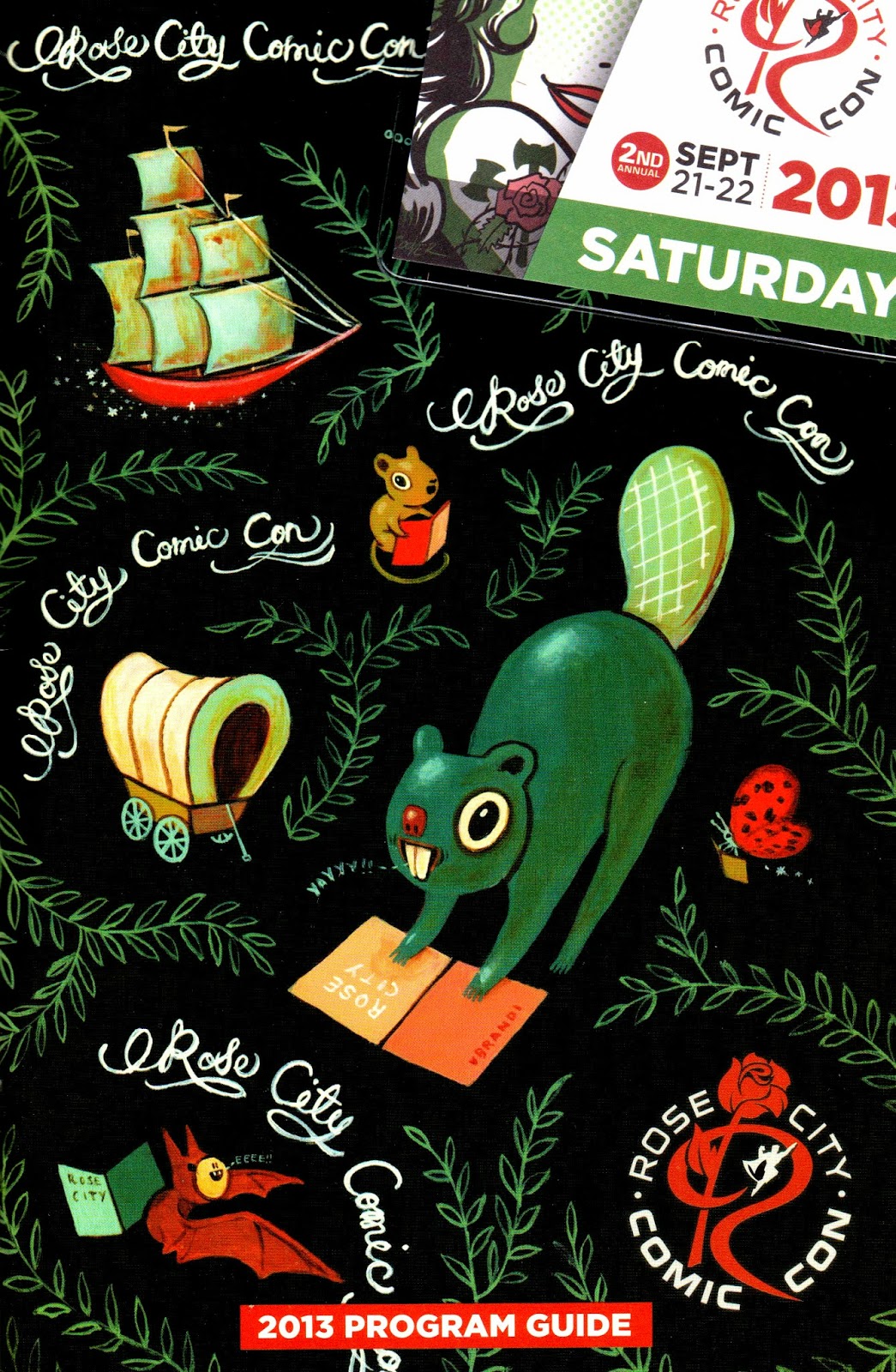
However, I spent not this past Saturday but the Saturday before with my dad at Rose City Comic Con, and had decided that an account of my adventure into nerd heaven and all around geek ecstasy would be a more than appropriate replacement for two weeks worth of our weekly comic book review. It's a little late coming to you as life has a tendency to happen whether or not you've set deadlines for your blog entries and planned to set aside time to type, and it doesn't always give you the chance to spend those entirely necessary several hours writing up something you'd feel is at least semi-acceptable to share with the rest of humanity. It may be a week late, but I managed to put together a little revisit of the awesomeness that was Rose City Comic Con for you guys, complete with pictures. So grab some Doritos, pop open a can of Rickey's tea, pause whatever game you're currently playing on an emulator, and get prepared to enjoy a little geek culture.


Now first things first: Our objectives on this trip?

One: To locate a handful of decently priced comic books essential to collectors--often referred to as "key issues"-- depicting the initial appearances of specific characters, deaths, or the introductions of important story arcs or scripts. My dad collects valuable comic books, so RCCC was a great opportunity to pick up some must-have issues he's been dying to get his hands on. 

(Check out our list!)


Two: To meet see some of the amazing comic book artists in the industry today and to not only get to see their work in person but to ask their advice about cons, comics, getting started in the business, techniques, and everything in between. 

Three: To find some awesome stuff to bring home that'll make all my fellow geek friends jealous. Merch is a must have.


Anybody around here a fan of cosplay? There were hundreds of costume donning fans attending the second annual RCCC, so many in fact, that documenting them became something of a chore. So as much fun as it was to "ooh" and "aw" over every Poison Ivy and Deadpool that walked passed us, we saved our lens for those that we adored above all else. I got a chance to share the spotlight with a couple of fellow fans dressed as some of my personal favorite characters, which was a lot of fun.


Sheesh, what a day. Nightcrawler insisted on taking a stance that seemed more natural to him, crouching like a demon devil creature, so that it was necessary for me to lean over awkwardly beside him to stay in the frame. Link had no qualms about getting up close and personal, but apparently I forgot that the point of taking a picture was to actually smile. I look super uncomfortable and awkward, which wasn't how I felt at the time at all. But so what? I'm a real person with a real face who has the terribly real weakness of looking really awkward in photos half the time. It doesn't bother me any. I don't have anything to hide from you guys. Plus, no matter what my face looks like, my new haircut looks pretty darn sweet. So there. Oh, and the girl wearing the blue fairy costume? I've got to give credit to the girl who pulled off Navi like a boss.  "Hey, Listen!...I like your costume!"

Now, It's a common misconception that comic con is a place for comic book geeks only, which is entirely untrue. Comic cons are more accurately pop culture conventions. If you're obsessively passionate about a book, movie, television show, toy, brand, podcast or game, you're most definitely going to find a representation of it somewhere at comic con. 

Whovians and trekkies run amok at conventions like this, and if I didn't spy a few handfuls of full-on bronys and furrys conversing with a couple of Game Grump lovelies, then I don't know a thing about geek fan group stereotypes. Most cons run a full floor of exhibitors and artists sharing and selling their crafts, wares, and merchandise, and RCCC was no exception. CD's, books, jewelry, prints, T-shirts, plushies, pillows, key chains, bookmarks, leg warmers...Almost any type of merchandise you can imagine is being held hostage by a nerd franchise vendor, awaiting either your dearest payment of cold hard cash or a breezy credit card swipe in exchange for their immediate release.

The guy running the booth where this mock NES game cartridge pillow was being sold flat out insisted that I at least take a picture with it since I looked like I was going to pass up the purchase. Sure thing, since I had no intention of dropping all the cash I brought on this one item. Sorry unicorn pillow. When we walked back past the booth later, they were completely sold out of ironic NES pillows. Darn.


If you thought we'd come home from the con with toys like this, you were terribly mistaken. I don't even want to know how much these guys are going to cost when they're officially released (but I looked i up anyways--a whopping retail price of $425. Yikes!) The displays for these guys was impressive ; half a dozen or more tall glass cases housing 1/4 inch to scale Iron Man action figures standing at eye level, lit up by strategically placed lighting, the whole thing surrounded by a rich square of red carpet? No wonder it took so long to work our way up front where we could get a good look at the Iron Patriot.


My dad struck up a conversation with some exhibitors who put together and sold custom lego sets. The idea is to prepare boxed sets for characters and scenes lego doesn't have readily available in their retail collections available for purchase: for example, a model of the original 1989 Teenage Mutant Ninja Turtles Party Wagon, complete with April O'Neil, The Ghostbusters Ecto-1 vehicle, or a scene from AMC's hit television show, The Walking Dead. So, these guys make their own set using pieces that lego as already made and sells the set as their own with customized packaging. My dad asked them how lego felt about it, and as it turns out, they had contacted lego about what they were doing, and they didn't mind in the slightest. "The way they see it, lego building blocks are like paint. The person who makes the paint doesn't sue an artist for painting a masterpiece with their product and selling it." That's not an exact quote, but it is essentially the gist of what he explained to us (I didn't have my notepad out and at the ready to jot down quotable moments). I found their work notable, and definitely worth a mention.


If you had your quarters at the ready (or were willing to use the conveniently close by coin exchange machine), you could play retro arcade games to your heart's content in an area set up for that precise purpose. I'm not sure which exhibitor set this up, but the fact that the Portland Retro Gaming Expo is right around the corner could possibly be a contributing factor to this awesome addition to the expo floor. Classic games like Mrs.Pacman, Tapper, and Tetris, as well as less conventional classics like CarnEvil made an appearance. Did I mention there were pinball machines? And holy comic grader batman! A super convincing Batmobile replica vehicle was on display nearby, which we didn't hesitate to photograph. Let's be honest here, whether it was screen used or not, a Batmobile is a Batmobile and is just plain cool.


Artist Alley is what they call the section of the con dedicated to artists and creators of every skill level and artistic style. I spoke to a comic book penciller who worked on Spider-Man, as well as an artist who worked on the Mega Man comics and got to browse through the original inked pages that he worked on from the Mega Man / Sonic the Hedgehog comic book cross over. I had an enthralling conversation with Jimmie Robinson, the author, artist and creator behind The Adventures of Evil and Malice, a short comic series about twin daughters of a super villain who aim to be superheroes. I conversed with sketch artists who went into hosting a table at cons initially as a way to get their portfolios reviewed by professionals only to stumble upon their future career paths as comic artists and regular con attendees and artist alley hosts. I met a man who illustrated these fabulous images depicting distorted perspectives of Portland coffee shops. Stunning! A man who once worked on older style cartoons and their comic counterparts such as Pinky and the Brain and the Animaniacs.

If there was one piece of advice that I could share with you that seemed the most integral to everything everybody mentioned to me when I talked to them it was this: If you want to get into something, just do it. If you want to start making comics, just start making them. Nobody's going to offer you a golden opportunity without seeing what you've done on your own, and experience by attempting and failing and tripping up and making mistakes is half the journey towards making something spectacular. The more I browsed the art being sold and struck up conversations with all sorts of creatives, I realized that I could be doing this. I could be the one on the other side of the table, offering my art to the world, making a little money, but mostly gaining experience and doing what I loved. I was inspired, to say the least.

I really wanted to purchase some artwork of my own to have, original and prints. I picked up three well-priced prints from Mika Darling, a young female artist like myself who attends Savannah College of Art and Design, pictured below. 


I wish I remembered the name of the man who illustrated this awesome sticker! His work was absolutely gorgeous, and I wasn't passing up the offer to buy this sticker when it only cost a dollar.


I nearly laughed out loud when I saw this colossus artist trading card-- and not at the artist's expense, but with pure enjoyment and intrigue. Nightcrawler may be one of my fave X-Men, but I couldn't pass up the hilarity of the pose Colossus was striking here. This is a sheet of canvas/cardstock the artist actually worked on, a one of a kind artwork, pencils, ink and everything...And now its under my watchful possession.


Look at these super cute and cuddly chibi key chains I found, $3 for one or two for $5. I got two as you can see-- Nightcrawler and a humanized version of LSP, the Lumpy Space Princess from Adventure Time. Mathematical.


I picked up this custom made notebook from Skulltastic at the con for only $5-- You pick a cover (there were dozens of awesome nerd designs to choose from, my favorites being a parody school book cover with a bottle of "Elm Street Glue" and the "Mathter's of the Univerth" set depicting both He-Man and Skeletor), choose a binding (A rainbow of colors to choose from), choose the type of interior paper (lined, blank, comic page), and determine whether you want it binded on the left hand side or right hand side, or from the top like a notepad. Once you've made all of these important decisions, they process the pieces and put your cover and bits in a machine, and momentarily you've got yourself your own custom spiral bound notebook. I can't wait to put my new notebook to use by sketching new ideas and scripts for FRIENDZONE (Installment #2 is in the works, btw! Hint, hint)!


And of course, I'm sure you're all wondering the same thing: "Did dad get his comics?!?"
Well, let's take a look...

...The Uncanny X-Men #142 and #141, the introduction to the Days of future past story arc and the deaths of Wolverine, Storm, and Collosus.


...Marvel Premiere #47 and #48, the 1st appearance of the new Ant-Man.


...A replica of Action Comics #1, for display purposes.


...The Amazing Spider-Man #135, the 2nd full appearance of The Punisher.


...Giant Size Spider-Man #4, the 3rd full appearance of The Punisher.


...Yeah, I'd say he definitely got what he was looking for. 

Now, tell me: who doesn't love freebies? Every Exhibitor and artist had a stack of business cards on hand, making keeping track of artists and their sample work and contacts a cinch! I scanned my favorite business cards so you could get a glimpse at the diversity the con had to offer. All art pictured below is representational of the artist's actual work. Cool, huh?


Something like 10,000 people were expected to attend this years convention. Instead, there was a whopping 17,000 people that gathered on the weekend of the 21st and 22nd in Portland Oregon. Now, I'll let you all in on a little secret...Wizard World is coming to Portland January 24th-26th in 2014. And that is a comic con I'm not going to miss out on.

Alright, well I hope everybody enjoyed this little recap. If you've got questions, insights, feedback or criticism, feel free to leave a comment. I'm more than happy to answer questions and have discussions, so feel free to talk to me. You can also tweet me or post on my face book wall, all the links are posted below.

Also, look out for a series of brand new artworks, being posted this week on all of my social media pages. Like, retweet, share, and all that jazz. I've got more work to attend to, so I'll end it there.

With all sorts of nerdy well-wishes,
Krystal Dawn

Facebook: Krystal Dawn
Twitter: KrystalDawnArt
DeviantART: kekei94

September 20, 2013

Rose City Comic Con Awaits

What with all of my weekly scheduled blog posts, I haven't had a chance to set aside a little time to just blog for the sake of blogging. Sometimes we need to fulfill that desire of ours to write without knowing what we're to write about before we start. Every now and then, its alright to face the unknown head-on and to tackle uncertainty with our everything. There aren't always rules. So we make our own, and then we break them. That's not a lack of commitment. That is what I call growth.

Early tomorrow morning I'll be heading over to Rose City Comic Con, and I cannot tell you how much pure excitement and adrenaline is pumping through me, more than 12 hours before they even open the doors to admit fans and con goers. This is only the second year of this particular Con, but since last year's was such a success, I couldn't pass up the opportunity to be a part of history in the making.

You can expect an avalanche of full-scale Comic Con review once I return. I plan on taking lots of pictures, meeting other nerds, browsing miles of comics and experiencing a multitude of fantabulous artwork, so there'll be lots to blog about!

As you may have noticed, there was no DIY or DET post on Wednesday. Why, you may ask? That current segment is being cleaned up, revised, and adjusted to fit my own time frame and personal tastes. I didn't like the direction it was taking, but have already envisioned a new goal. Don't worry: it'll still be a DIY segment, just a different angle or take.

In other news, drafting has begun for the second installment of "FRIENDZONE", and I can't thank you all enough for the all of the views and "likes" on the first piece, which was a visual disaster to say the least. I love it, and it is what it is, but I made so many mistakes that I can't even count them all. I should be making a post discussing what not to do when making a comic. The good part? I learned tons! So the next installment will be much even better than the first. I promise that this time I won't spend extra time checking that I've spelled "misogynistic" correctly and neglect such gems as "ufair" and "rediculous." I've even done a little background study on how to write good jokes and how to incorporate humor into comic strips. I spare no expenses when it comes to giving you all the best I have to possibly give!

And with that, I must bid you all a goodnight. Although, the chances I'll sleep at all are slim. Rose City Comic Con. Perhaps I'll see you there?

With lots of love and anxious excitement,
Krystal Dawn

September 16, 2013

Caravan Kidd #3 (Comic Review #2)

Here at www.kdvan.blogspot.com, Mondays mean one thing: bargain bin comic book reviews! All comic book stores seem to have at least a few boxes dedicated to cheap comic book rejects. Whether these are little known indie comics, one-shots that didn't stand up to the test of time, familiar faces in embarrassing crossovers, or forgotten heroes who've simply been passed over one too many times, there's always the opportunity for the occasional dumpster dive to reveal a treasure among the trash. Its time to give this week's book a read, a review, and a rating so you can either add this steal to your reading list, or know to pass over a mounting catastrophe.


Quick Specs:
Title: Caravan Kidd
Issue: Part 1, #3
Publisher: Dark Horse Comics
Publication Date: September, 1992

Staff:
Story and Art: Johji Manabe
Translations: Dana Lewis, Toren Smith
Lettering and Touch-Up: Wayne Truman
Edited by: Chris Warner, John Weeks

Alright, so for today's bargain bin comic book review, we'll be taking a closer look at an early issue of Caravan Kidd. Issue #3 to be exact. I picked this up at a comic book store in a neighboring town, quite literally from an actual bargain bin, so it's bound to be filled with cheap thrills.

To kick things off, let me take the liberty of saying that before today's reading, I was not familiar with this comic book series at all. Not in the slightest. Typically what I see sold for close to nothing are not-so-super-hero comics and one-shot indie forgottens. Manga in general is a bit rarer to find as it's considered widely popular to many. I used to be quite the manga authority, but had never once heard of this book before now. 

As it turns out, my ignorance was a blessing in disguise.

Judging by the cover art, this book is chock full of stereotypical manga style artwork. Look at this chick's eyes--they're huge. Unruly, unnaturally colored unisex hairstyle? Check. And her outfit? Skimpy. Perfect. Looks like we've got a classic 90's manga on our hands. If it weren't for her eyelashes and the sliver of cleavage,  I would've mistaken her for a man...Yikes. The art in itself however is crisp, clean, and the colors are extremely fresh and vivid. Classic copic marker style coloring technique seems to have been used to great effect. Next time though, I'd like to see a few more lines describing the texture of her hair, and less highlights in the fabric covering her crotch. Could you do that for me, Manabe?

Let's get right into our synopsis here. Wataru seems to be a normal kid.. Err, pre-teen? Tween? 17 year old? Twenty something or other...? It's hard to tell with this art style, so let's just assume Wataru's just our average 12-22 year old nomadic guy travelling with his alien companion. Him and his alien friend, "Babo," are forcibly accompanied by a strange, headstrong part woman/part animal anime girl named "Mian" who possesses unknown strength, a mysterious past, and borderline risque costume attire. After Babo lashes out at Wataru for something that occurred in the previous issue, he storms out to literally "take a dump" outside his and Wataru's camp (a tiny tent in the middle of nowhere). Here, Babo runs into hundreds of armored soldiers while doing his business as well as dozens of military vehicles, an air ship, and a massive armed battle ship.The issue goes out with a bang when this mysterious woman manages to somehow take out the entire battle ship and unnamed military armada without the use of a single weapon and is then professed by the defeated general to be a "breaker," intent and capable of bringing down the very mechanism and workings of civilization as they know it.


Are you ready? Are you sure? Alright, let's do it.

So, before we start trashing the story line, dialogue and plot, we've got to take two things into account. The first thing is this: This story has been translated from its original language and form. The intention of the author was left in tact as much as was appropriate for American audiences I'm sure, but in the overall scheme of things, it makes no sense to nit pick and grumble over minor details that aren't the writer's fault (At the very least we must blame those who edited the story). Now the second thing to consider will be a bit of a shock to some of you: once you look past the obvious character stereotypes, poorly carried over dialogue translations, and pace-less mess of nonstop nonsense events, you'll realize the actual story and concept itself isn't half bad. The story is oh-so-anime, but there were details added to the plot that, while limited, that provided the necessary interest level to keep the reader turning the pages. For example, the general making a brief rference to his knowledge of exactly who Mian was and more importantly what she was. More often than not, however, it seemed I was flipping back through the pages so I could accurately piece together what in the world was going on, as the story was quite difficult to follow.

The art, now, is a whole other sack of potatoes.

Yes, the artwork is extremely reminiscent of every other manga artist in the history of manga artists. That aside, some of the artwork is truly gorgeous to look at, especially the elaborate machines of mass weaponry, intricate explosions, extensive clouds of dust particles and explosive action sequences. The characters were clean and tolerable, but don't feel at home in their finely wrought world of gingerly clipped detail and solidly employed design principles. The whole feel of the atmosphere illustrated gave off a very "Akira Toriyama" vibe, and I was keenly aware that I felt as though I were reading a not as well written, watered down Sand Land knock off throughout the entire story.


First, let's talk about the positive aspects of this mish-mash of mediocre story-telling and fairly decent artwork.

I really loved the art style when it was used to depict the precise angles and technological detail of mechanical weaponry, armor, and machines. Thanks to the artist's attention to detail, there were panels where even the dirt looked exotic and exciting...Man, I really wish I had more reasons to like this book.

Now let's take a few moments to get into what really, really bothered me about this comic as a whole.

There was an abundance of unnecessary swearing in the character's dialogue. What I mean by unnecessary is that none of the curse words were used in a way that added any sort of depth or meaning to the situations presented in the story. They were hollow, empty. Words used simply for the sake of using them. The dialogue between characters sounded too generic. There wasn't any sort of chemistry between the characters in a way that made you care about them or their relationships to one another, or their relationship to you yourself as the reader. Wataru's alien sidekick Babo was certainly intended to be comic relief of sorts, but was instead nothing short of repulsive both visually and verbally. Also, for obvious reasons, the female character's outfit is ridiculous. Oh, and to complete the circle of silly traditional manga stereotypes? SERIES SPOILER ALERT: she's a robot. You're welcome.


Final Thoughts?

I've got to learn to read Japanese someday. I've got the feeling that the original translations in conjunction with ideas and concepts native to the culture they were influenced by probably make a lot more sense than what we end up with here. All in all, decent art, but poor story telling.

Story: 2 stars
Art: 3 stars
Theme: 2 stars
Characters: 1 star
Presentation: 2 stars


Overall: 2 out of 5 stars performance.

If you're interested in authentic manga, give it a glance, you might like it, but don't expect too much. If you're not really into the Japanese art style, I don't think this is the one that's going to win you over. Just go ahead and give it a pass. 

Interesting fact: if you look this manga up on wikipedia, there's literally nothing there but a 4 sentence synopsis of the entire series, a fragmented description of 4 characters, and a few unreliable references.

Facebook: Krystal Dawn
Twitter: KrystalDawnArt
DeviantART: kekei94


Translate

Looking for Something?